WEBSITE PRODUCTION & PUBLICATION
IMD Program
University of Washington, Bothell
John, Kevin, Ramya, Spencer

OUR WORK
Our team merged from two pre existing groups: website publication and management. Through close collaboration, we dedicated our efforts to enhancing the UI of the Dear Digital Equity website. Our primary focus has been adding new pages and ensuring that all of the 2023 IMD cohort get their projects published. Additionally, we have also conducted interviews with stakeholders to gain valuable insights and incorporate their perspectives into the development of the website.
(Alt Text: The image on the right is of a pen resting on a half-opened notebook that rests on a wooden table. A laptop is blurred behind the notebook and is in company of a coffee cup.)
1
SURVEY
In our early process of our project, we started getting familiar with the site pages and functions. Our Professor, Dharma Dailey, had conducted a survey on this website’s page UI and targeted it towards the 2023 IMD cohort to take a designer’s perspective onto the site. We have gotten permission and have used the survey as reference on what were the common themes that our peers noticed when browsing the pages. Common themes included:
Peers wanted more visuals and interactions to the site in order to separate the large amount of information on each page.
Peers noticed that there were inconsistencies among the pages including sizing, color, and style of the pages.
Peers want more categorizing into the site such as tagging, or using search engines to find information.
And so we continued to…
(Alt Text: The image above are screenshots of our ideations in Figma, where we combined our ideas and got feedback from Professor Dharma. Here you can see digital sticky notes, images that resemble good UI, and navigation ideas to have an easier flow.
ideate and find inspirations for the site pages.
2
INTERVIEWS
We have also conducted interviews for our stakeholders in order to get their perspective on their thoughts on website design and their overall thoughts on Dear Digital Equity.
“Well, you wanna you know one of the pitfalls of telling a story is that if you focus too narrowly, maybe saying one person, story, or just a few people that might not be representative of the entire group that you're trying to convey message a message about.”

Mira Shah
Mira Shah is a User Experience Researcher at Stripe and formerly at Microsoft, has a background that includes working with people with disabilities.
By focusing on user experience research, Mira Shah likely helps design products and services that meet the diverse needs and preferences of users.
Interview Information/Reflection: Mira actively works as a User Experience Researcher at Stripe and has much experience with UX storytelling. Because of her experience with Storytelling, we wanted to pick her brain apart so we could find out what actually makes a good UX story.
When we interviewed Mira, she talked a lot about the multimedia elements she uses to tell a narrative. At some point she followed a few people with disabilities day to day with a video camera, to document any pain points within their routine as well as to capture anything she may have missed. She opened our eyes to showcasing new forms of technology and how they would be beneficial to articulating ideas that may need design implemented.
She also talked about within UX storytelling, there needs to be Qualitative Data as well as Quantitative Data used in order to effectively prove your point and spread your messages. These two things are very different forms of data collection, so as a designer, you need to be responsible for bridging the gap between Qualitative and Quantitative Data. Whether that be graphs, pie charts, etc. Doing this will be the most effective means of proving points as well as keeping the viewer engaged.
“Education is not the filling of a pail but the lighting of a fire.”

Min Tang
Min Tang is an Associate Teaching Professor in Media and Communication Studies at the School of Interdisciplinary Arts and Sciences, University of Washington Bothell.
Their focus is the studies of capitalist relations and power structures that shape the provision system of communication and information in society.
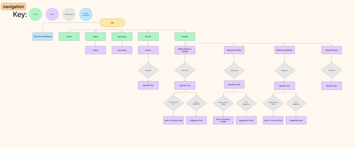
Interview Information/Reflection: The interview was taken from a journalist’s perspective of the Dear Digital Equity site in its former state. They stated that the strongest aspect of the DDE site was the clear navigation of the site. User flow from each page felt natural and was not misleading or confusing. The topic of digital equity had a positive impression throughout the site, allowing the user to be invested and look further into the site’s content.
Pain points that arose in the site came from the sites UI. The layout of the site’s content was uneven across pages and did not have a consistent theme. Some pages would use the limited tones of purple in its imagery and headers, yet some pages would display full colored images that felt out of place with the site’s theming. There were also instances where pages felt unengaging due to a lack of visual representation. Examples included some bios not having a profile picture to display and pages not having any images to showcase the work of the shareholders or to add visual detail. Text was also criticized for having page descriptions or body paragraphs being too wordy that they needed to be. Feedback was to shorten the length of the introduction page paragraph for Digital Design space and the description under the About section.
3
IMMEDIATE CHANGES
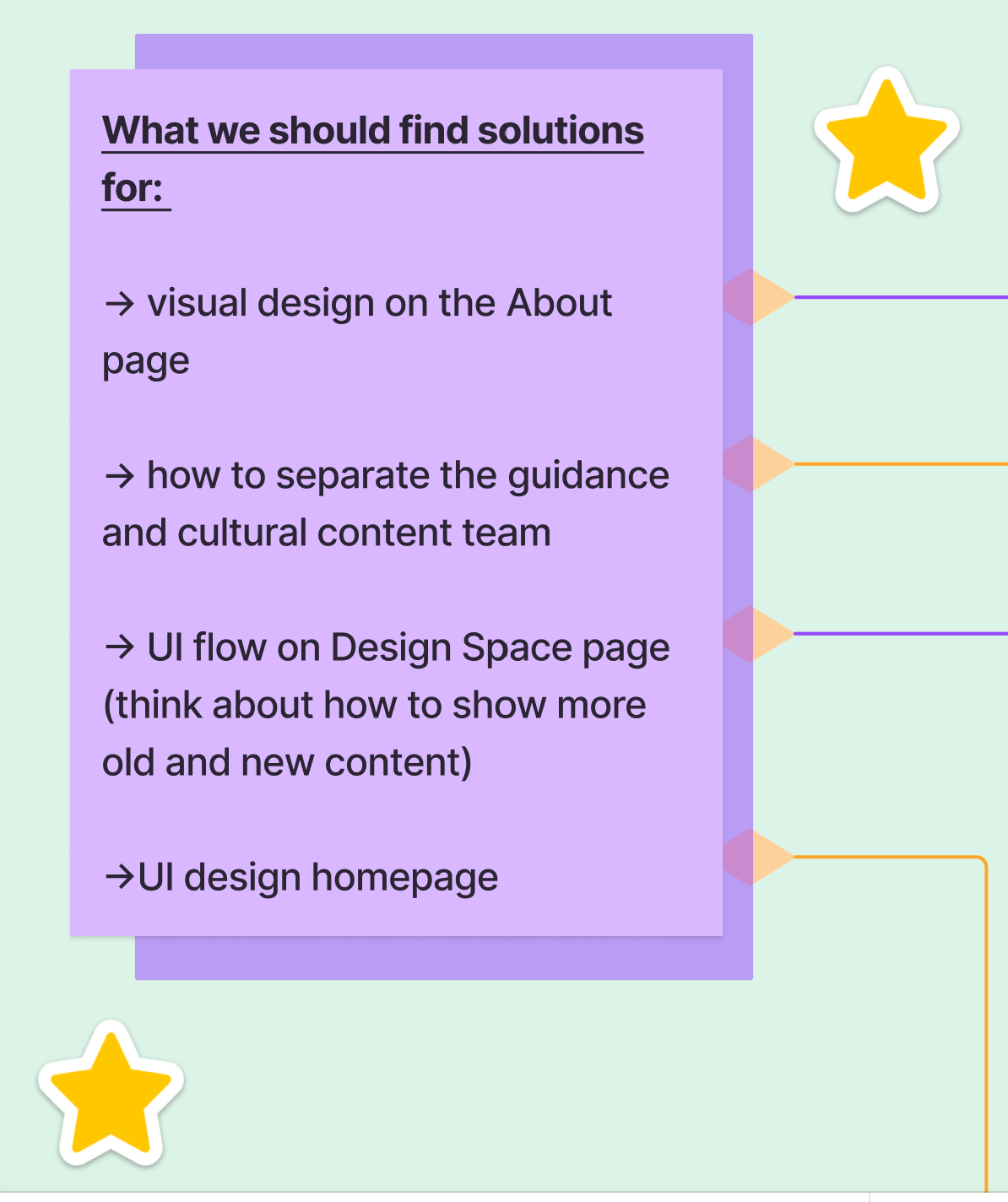
In the meantime of finding inspiration, we started looking at the site more closely and noted down anything that we would like to change in order to keep consistency and implement the results we got into the class survey. We added all the notes into a spreadsheet of both some of the rankings of the feedback we got from the class survey and requests in order to get approved by Professor Dharma.
-
Some of the things that we wanted to redesign based on our experience learning from UI theories and ideologies was the:
A. Having consistent purple headings and text for each page that has it.
B. Move the Contact Form in the About page closer.
Edit: we have deleted and moved the contact form to the home page.
C. Including search bars and tags to the blogs and any page with a lot of information.
D. Changing the navigation headings for shorter and more impact.
Edit: was scratched since we wanted to keep the site simple.
E. Changing some of the alignment and spacing of the pages.
-
6 — Visuals: engaging visuals
6.5 —Digital Equity: having a page on what Digital Equity is
8 — Consistency: Making the font and colors consistent among all the pages (including alignment and sizing)
10 — Spacing: Making the paragraphs and forms closer to each other and delete extra white space
10 — Filter: Adding a search function and filter options for content

(Changed the font and color of each heading page)

(Added the call to action/contact form from the old About page to the home page)

(Changed the Home page background animation and included a transparent box around text to see the text better)

(A previous edit that we have done to the events/project news page was included sub-sections of the Upcoming Events and Past Events since the past events were all the way at the bottom. After careful consideration of how compatible it can work with Squarespace, we instead discarded it)
4
ADDING PAGES
Once we started finishing the immediate designs of the original page, as a group we decided to start working on adding new pages to the site to showcase all of the student work as well as increase awareness of upcoming events and traffic onto the page. These pages soon came to be the Project News, the continuation of blogged toolkits Digital Equity as a Design Space, and the About pages.
Project News
~
Digital Equity as a Design Space
~
About
~
Project News ~ Digital Equity as a Design Space ~ About ~
>
(Alt-text: a show of past work and what we have changed, which includes having an image based events where each image going down vertically with information placed onto the right)
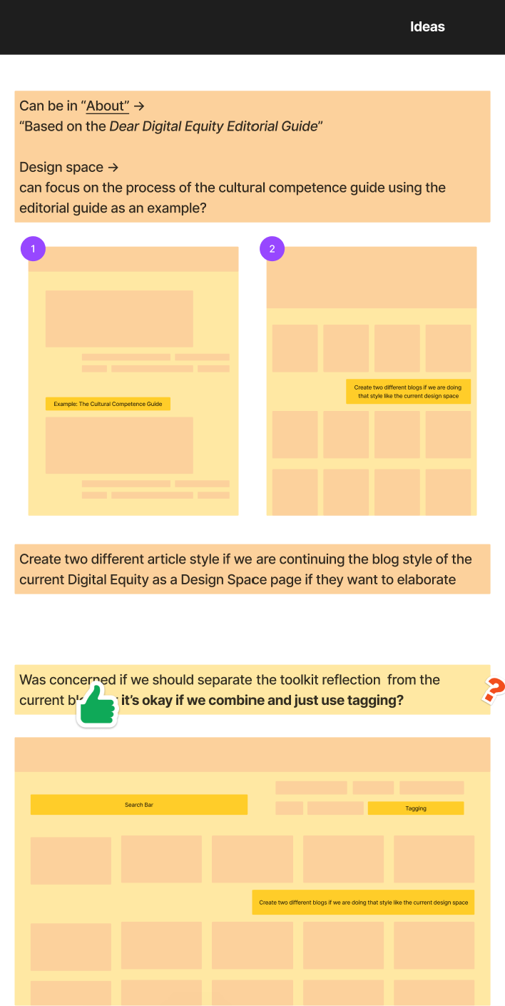
IDEATION
I
TOOLKITS
II

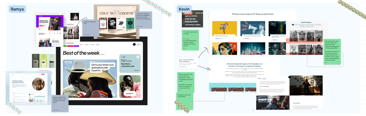
(Here are some of the ideations that we brainstormed on the Home page, About page, and the ideating on how to add everyone’s projects to the site)
One of the big parts of our roles was collaborating with other teams and learning about their projects. We met with most of the teams, shared our updates in learning Squarespace and our design changes, but also providing toolkits for teams who want to be able to easily add in information or if they wanted us to create the pages for the project, would know how it would look like. We also wanted to get feedback and see if they were satisfied with the visual and the engaging elements on their project templates so that their needs are also met! We also included templates that would be used throughout the site in order to gain any feedback or have this template ready when implementing new pages!
DIGITAL EQUITY AS A DESIGN SPACE
III
So after creating toolkits, we also created spreadsheets for constant updates with the other teams and if they either wanted to create their own pages or they wanted our help with publishing their page onto the site since we were in charge of publishing and management of the site. If was near the later stages of our project that we decided to continue based off of the current blogs posted in the page but separate the cohorts and types of information by showing the most recent. We also noticed that Squarespace’s blogging didn’t allow much creative freedom with images and visual buttons so we decided to have the format as pages and then link a blog picture to the page so when a user clicks on the blog picture, it will go to the actual page! Through collaborating with other teams, we were able to learn skills of working with other teams while also working on Squarespace and learning the best ways to showcase information.
PROJECT NEWS
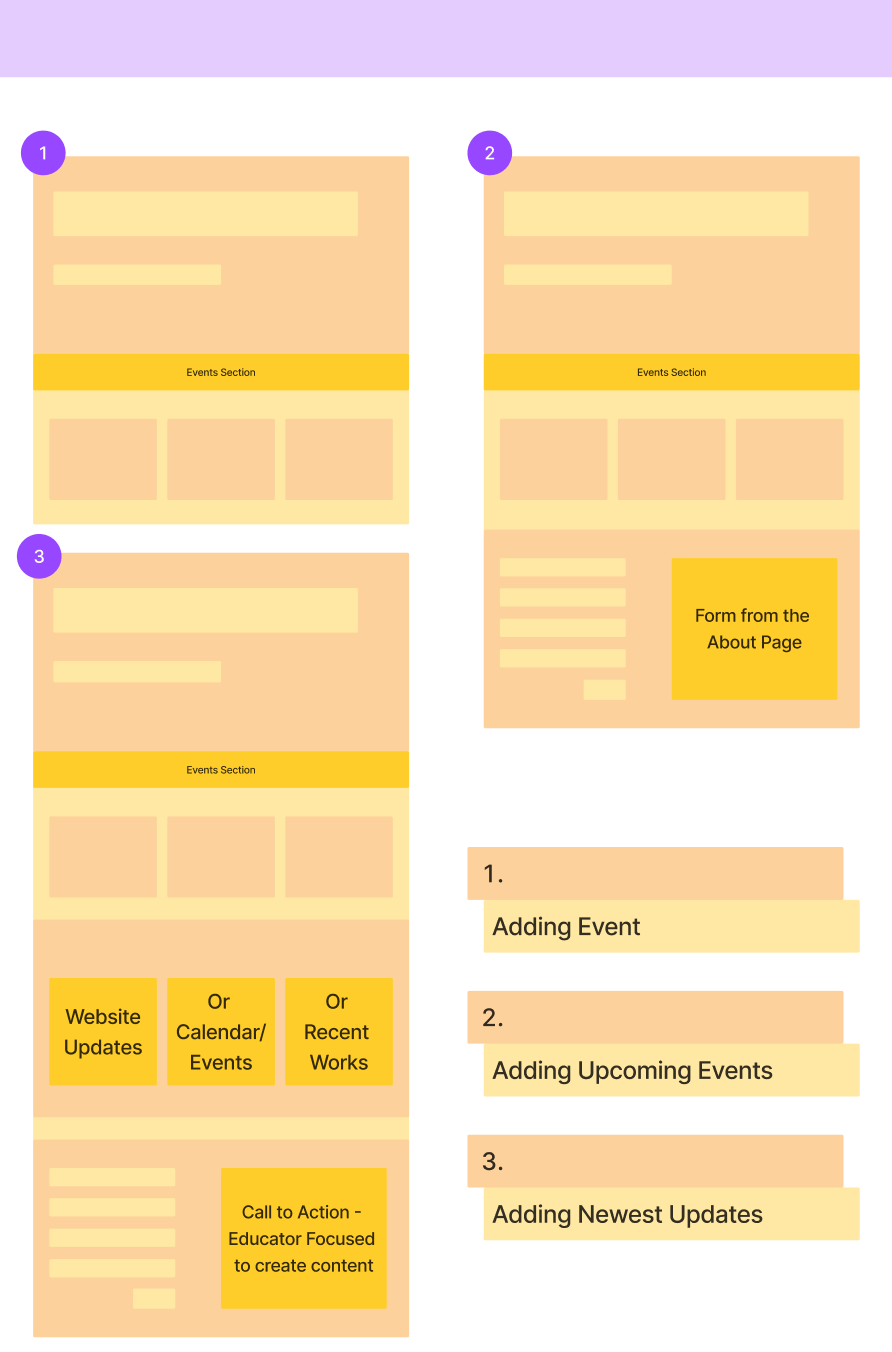
IIII
In order to showcase events, we also wanted to change the current About page, which did showcase events but only past updates. Since there was going to be new content uploaded such as conferences and podcasts, we wanted a page for that so thus became Project News! At first we wanted to separated the events as past events and upcoming events since we did feel like the events felt organized by after finding other ways to present the page, we decided to go with simplicity in having all of the events there since Squarespace had no ways of creating sub-sections without a lot of code. We created the page so that the most relevant event would be at the top and past events would be crossed out at the bottom.
ABOUT PAGE
IIII

(Alt-text: Image of created templates with images to go with the text)
(Alt-text: Images of working on Squarespace)

Since our IMD cohort of 2023 worked on the DDE from the spring to the summer of 2023 (three months), we decided to update the About page. Noticing all of the text and lots of white space, we also discussed with Professor Dharma and decided to create a dropdown for student cohorts, community advisors, and educators to give credit to each stakeholder. We made sure to include information from the previous about page into each section.
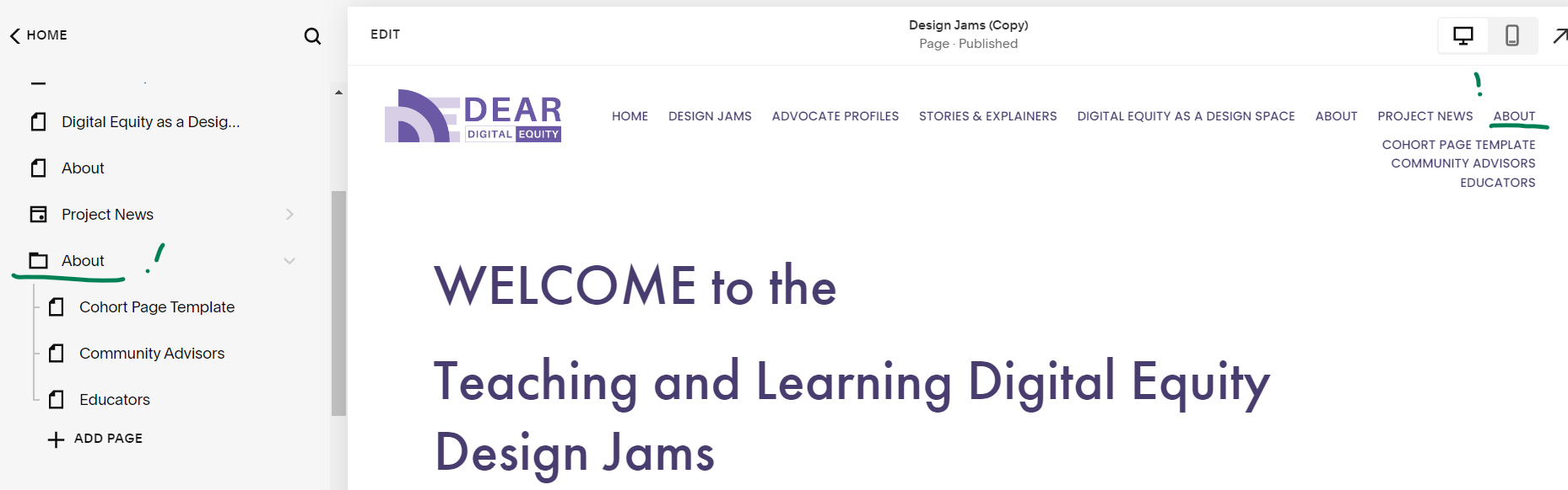

(Alt-text: one image at the top of three images. The top image includes Squarespace screenshot of now the navbar looks in both Squarespace and on the page. For the three images below, they are snippets of the about page, where each page says a paragraph about the people and show their names and pictures.)

REFLECTION
Overall, this project, helped us understand both how to publish and manage a site as well as collaborate with other stakeholders when working on the website. Dear Digital Equity is such a wonderful tool and experience where stories are told and is a very educative platform where we learn more about digital equity! We could see the work put onto the site and the years of work and our team and learned more from designing parts of the site to communicating and implementing community projects onto the site!
(Alt Text: The image on the right is of closeup of a notebook with a wooden blue inked pen diagonally placed across the center of the book. There are ideas and designs drawn into one of the pages of the small notebook.)
Meet the Team
-
![]()
Ramya Sandadi
Website Manager
-
![]()
Kevin Ortiz-Palacios
Website Content Manager
-
![]()
John Carvalho
Website Publisher
-
![]()
Spencer Pruitt
Website Publisher